
last week I promised myself to analyze the flow of cyclists on the Naples seafront cycle path in view of the controversy arising from a small group of people who would like to remove it from its current position; the poor use of the same was also cited among the reasons.
In this small article we will a geostatistical analysis of the use of that infrastructure thanks to the data provided by the Department of Infrastructure, Public Works and Mobility; of the Municipality of Naples. These data in particular refer to the European Cycling Challenge 2015 and show the movements of the participants in the challenge, movements monitored thanks to the official application of the competition.
The data you are working on processed are in csv format and report the set of track points of the individual movements.
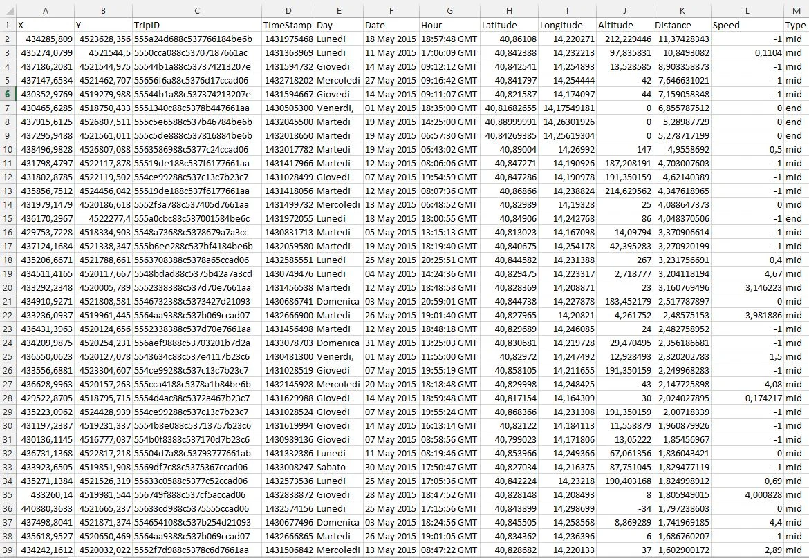
The first thing that was made therefore it is import the csv into QGIS 2.8 and generate the shapefile with which to make our evaluations.
The question you answered wanted to answer is the following: the seafront cycle path is actually used?
On the left you see a glimpse of the point cloud. So how it is not It was not possible to make any evaluation for which subsequent processing was necessary. The processing that was carried out was the creation of a heat map and, thanks to the spatial queries, it was possible to tried to answer the above question as well as carry out some further investigations such as identifying the most suitable journey. short and the shortest long.
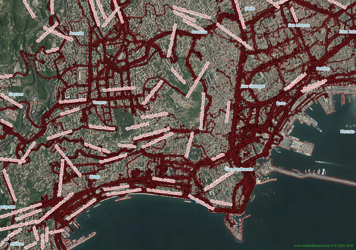
In order to generate a correct heat map, the data was made congruent with the spirit of the challenge by eliminating, thanks to selection operations on the attributes, journeys exceeding 25km (maximum limit allowed by the challenge which is aimed at urban cyclists), journeys made on motorways and ring roads (it is evident that some joker left the application active when transiting on road infrastructures with means other than bicycles), journeys less than 500m and the only track points present on the railway infrastructures. An interesting fact is in fact it was the one relating to intermodality bike-train which is It was also widely used by those who participated in the competition. Once this cleaning was carried out, the first data was brought out: little more than that. about a thousand trips were made and on average approximately 6km per trip were travelled.
Once the cleaning has been carried out, the it was possible to generate the heatmap.
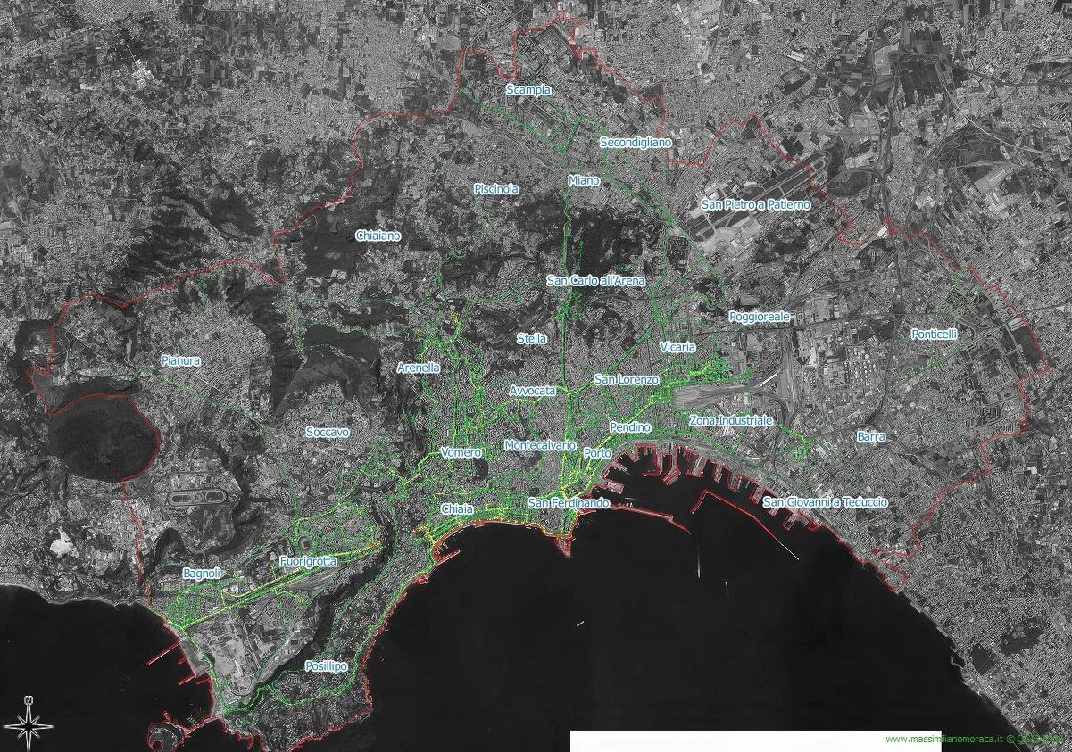
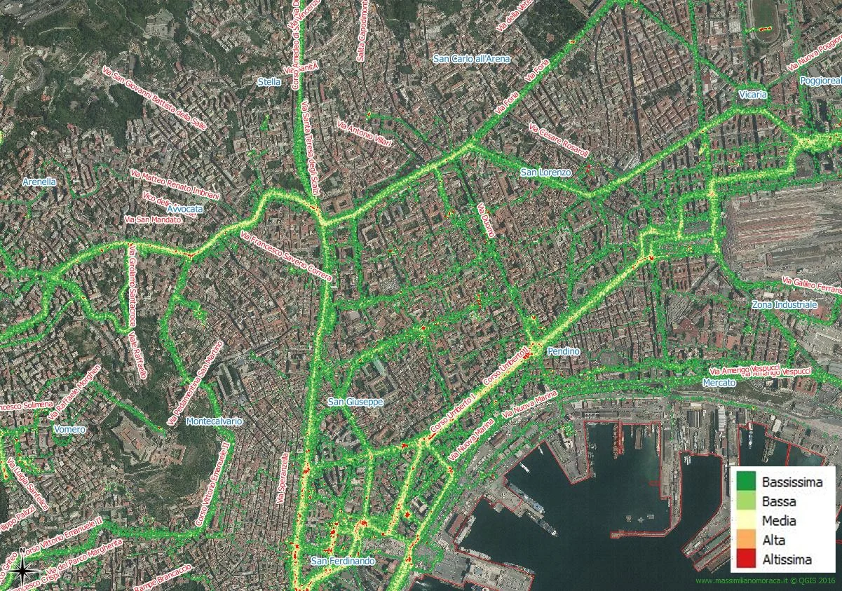
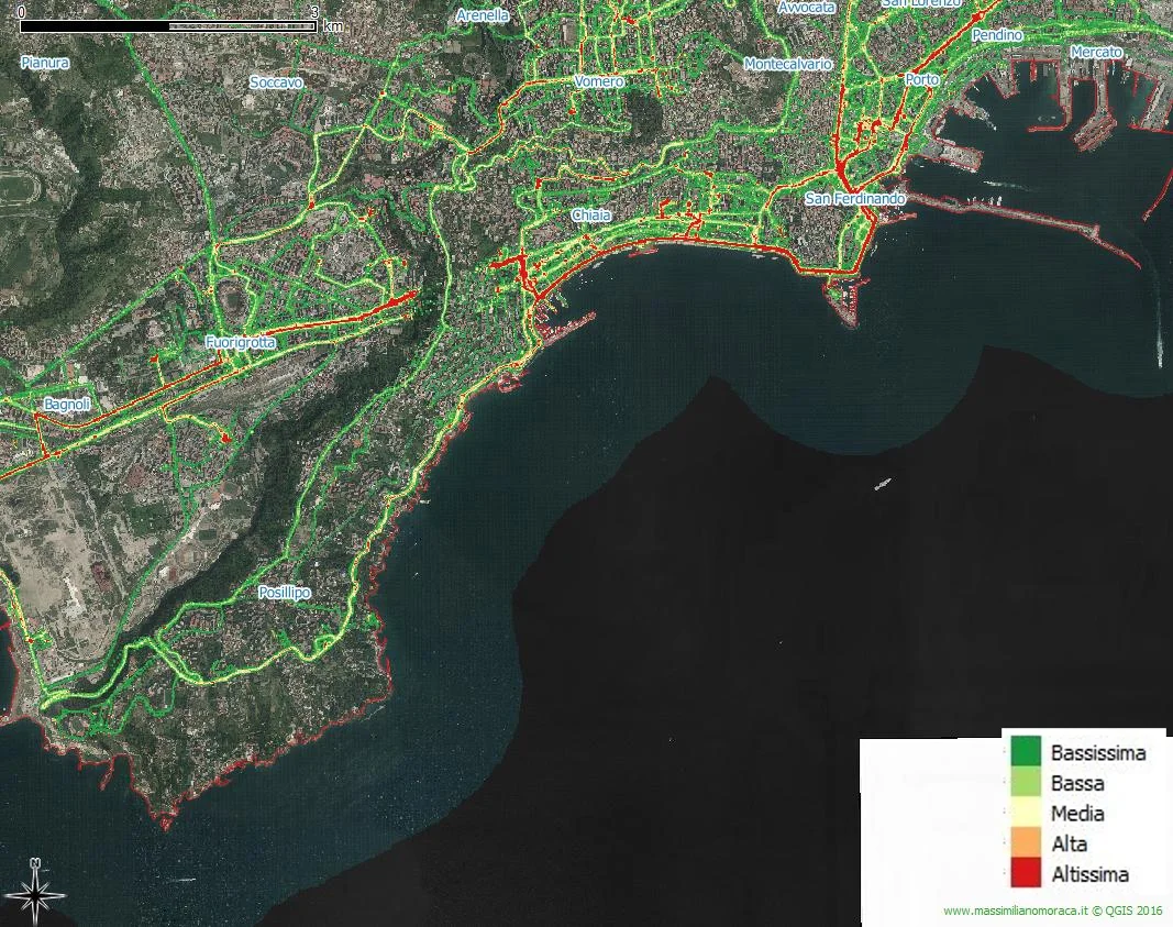
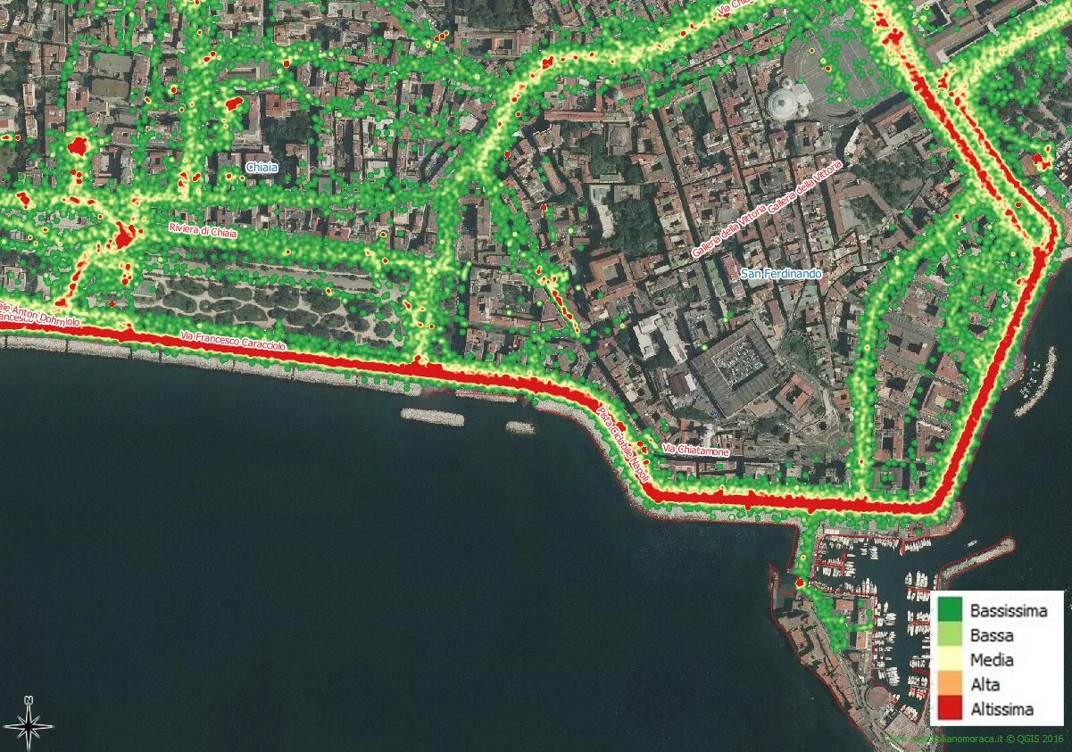
How can you note the density of points is high/very high both on the cycle path itself, we therefore have an initial answer but it is not enough, and in other city areas such as the high ones (we often hear that Naples is not suitable for cycling because the Vomero and Posillipo hills are present) and the central station/Corso Umberto I area; right on this last road axis is a new cycle path is under construction.
The challenge is quantify the flow of cyclists that affected the cycle path.
Since it is not on the City website Naples Metro and neither on that of the Municipality of Naples it is If a street graph was available, I turned to OpenStreetMap. I was able to download the street graph of the city under the Creative Commons Attribution - Share Alike 2.0 license (CC-BY-SA). of Naples which also contains the data relating to the name of the street displayed.
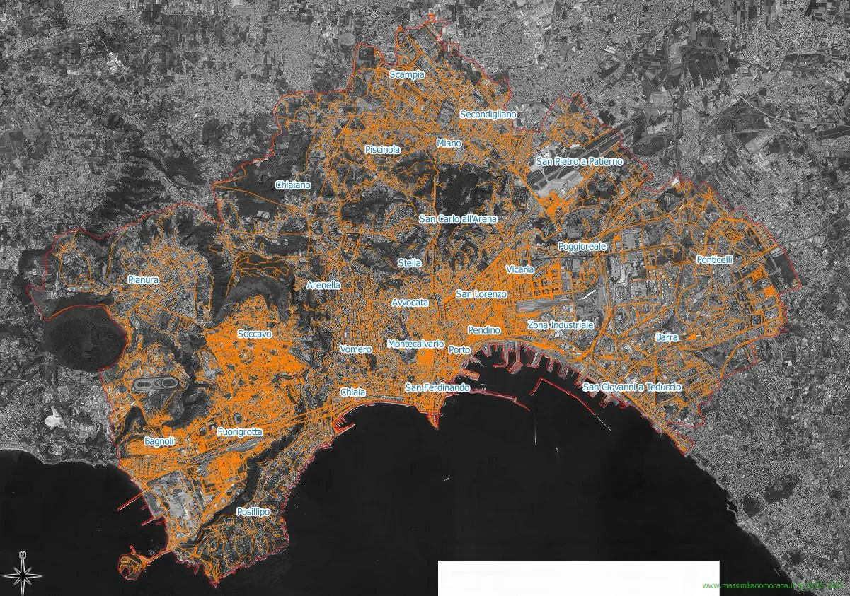
Thanks to that graph, cleared of motorways, expressways and railway sections, I was able to complete the following calculations and give an answer to the questions above.
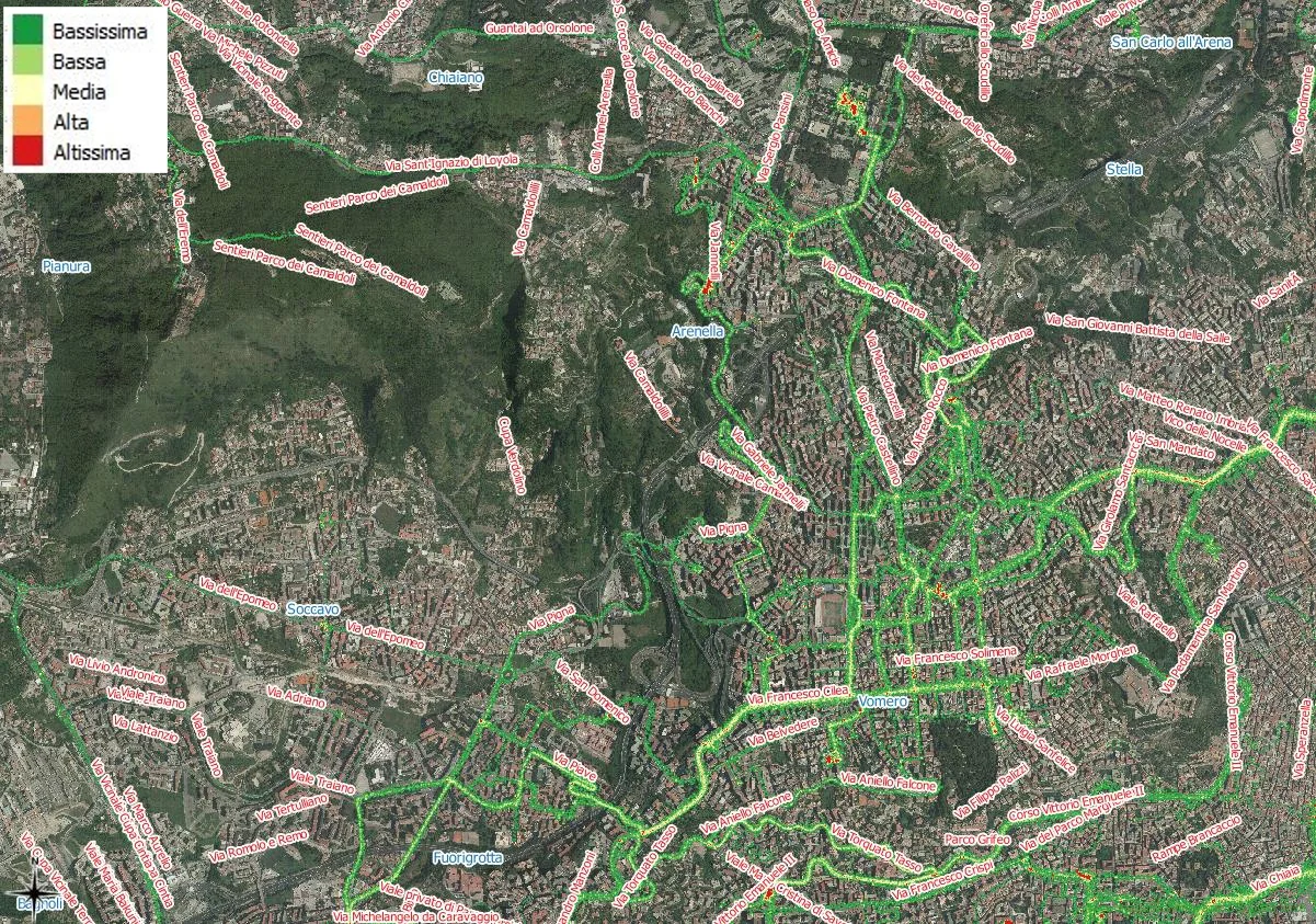
The first thing I did was create a buffer of the street graph, assuming that all the streets of Naples are 3m wide; is an approximation undoubtedly but it is useful for this analysis.
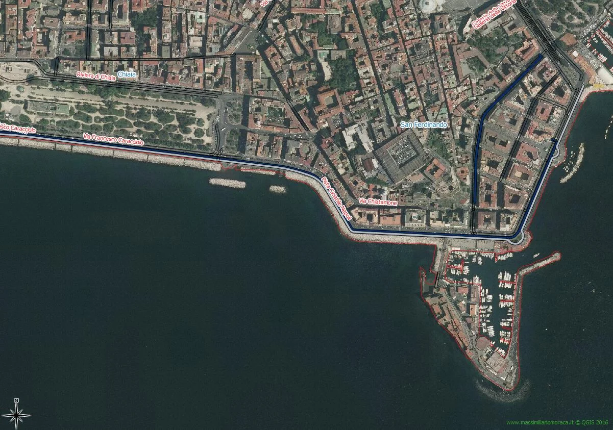
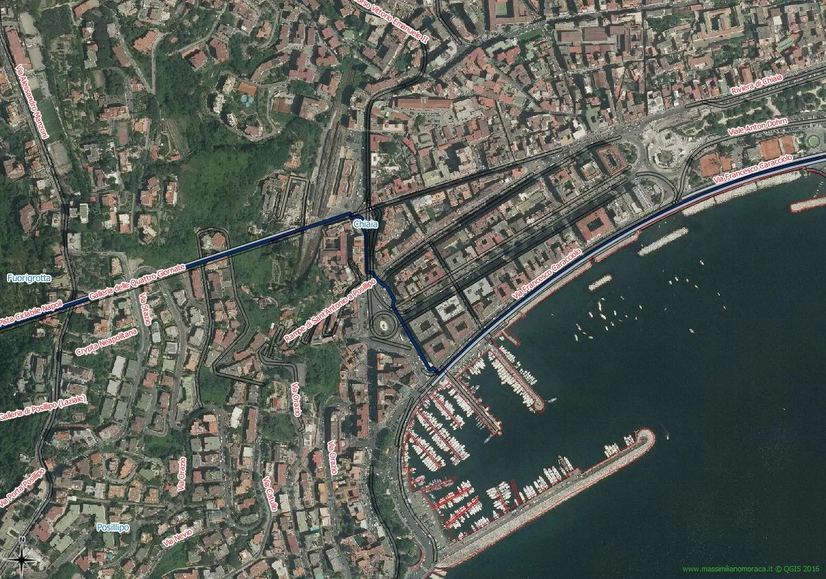
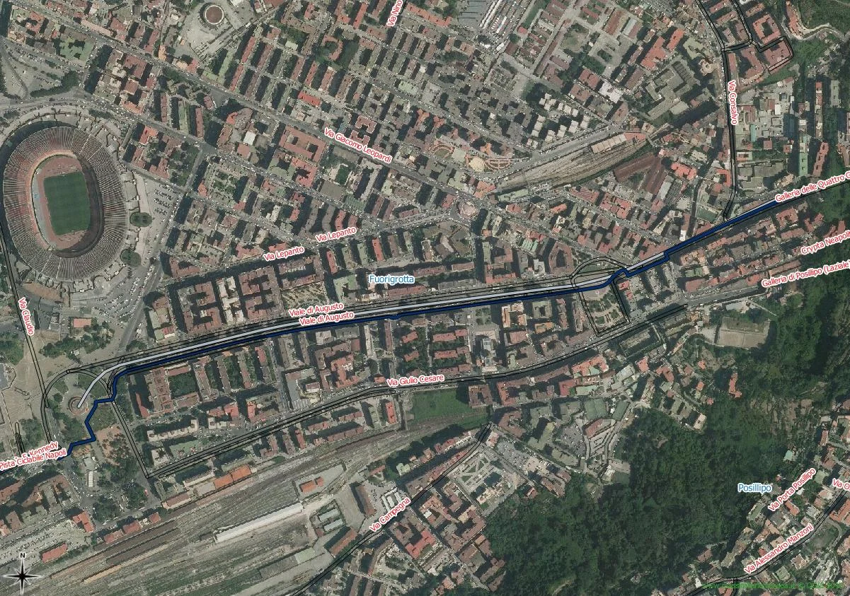
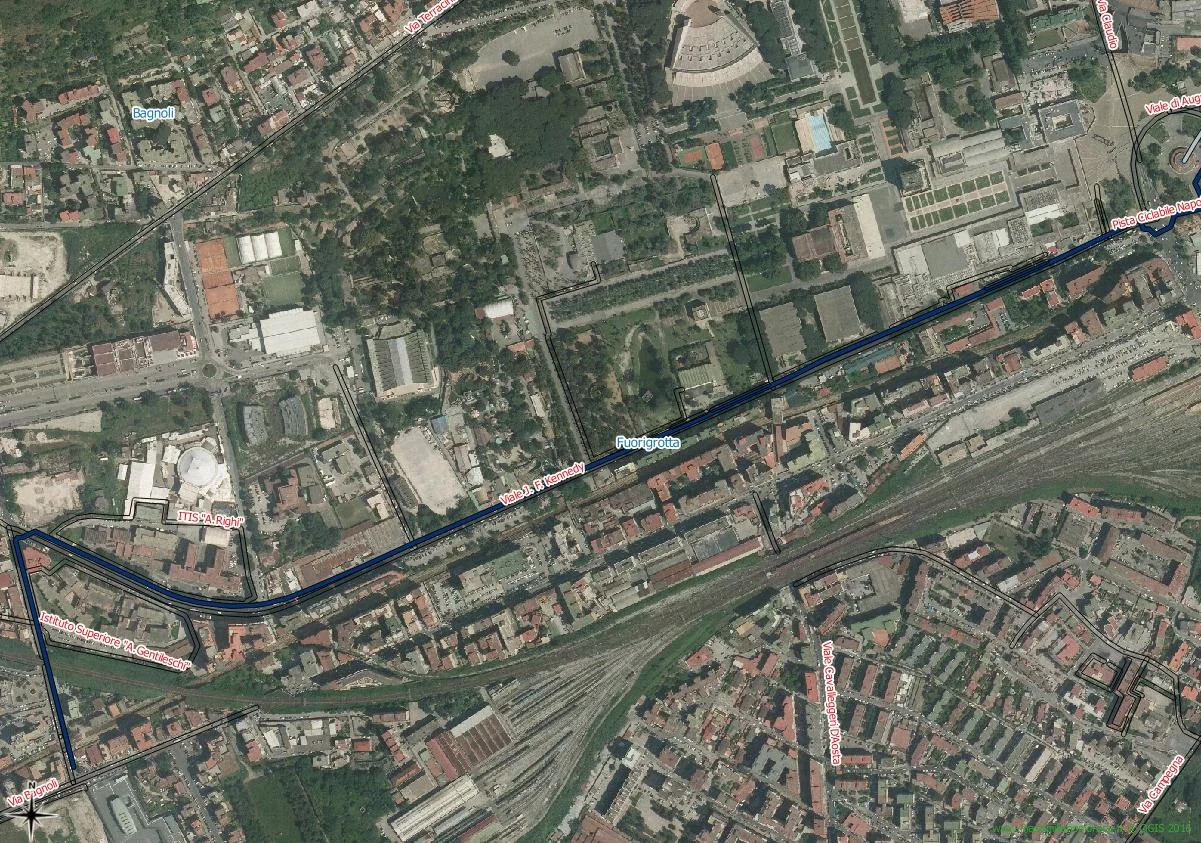
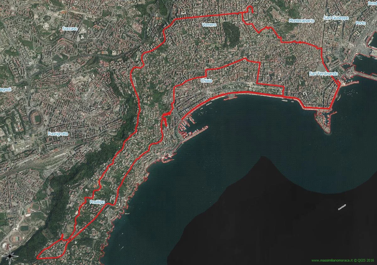
Subsequently I performed a spatial join between the previously created buffer and the track point cloud, then I launched a query asking to display only the roads with a density of of points greater than 5000 and the result is state that the cycle path, in its entirety from via Partenope to Bagnoli, had the highest join count, around 18,000 points. How can you therefore, seeing also from the images that follow the answer to the first question is yes, not only is the seafront cycle path used but it is his entire journey.
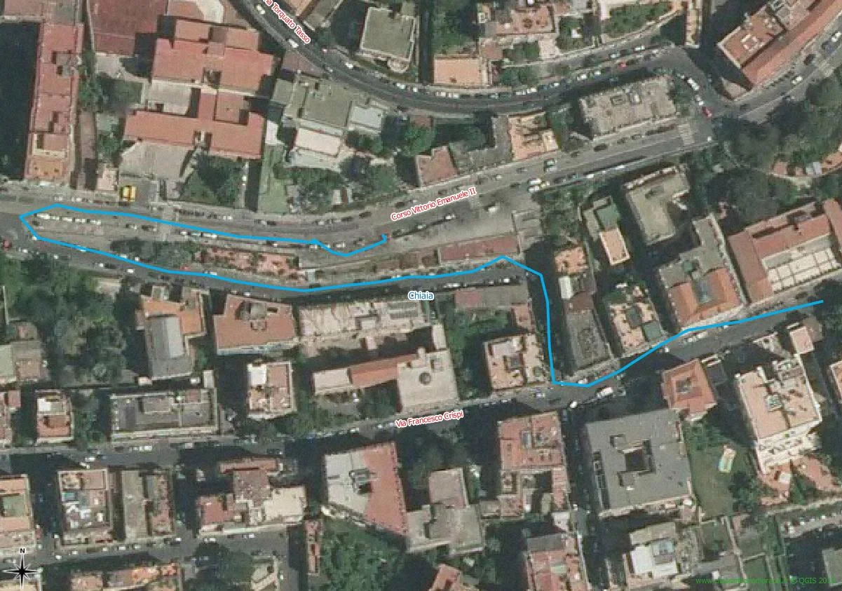
Furthermore, you can identify the most suitable journey short, little more of 500m
And the longest journey long, just under 25km
We can put a stone over it: cycling in Naples it is possible, the cycle path is a useful infrastructure which, despite all its limitations, is improvable, it should not be eliminated but should rather be branched out as much as possible. possible.
Below you will find a very interesting video on how it is possible to animate a heat map making it dynamic, as soon as I can. I really want to reproduce the same static map that you saw in this article in a dynamic one.